
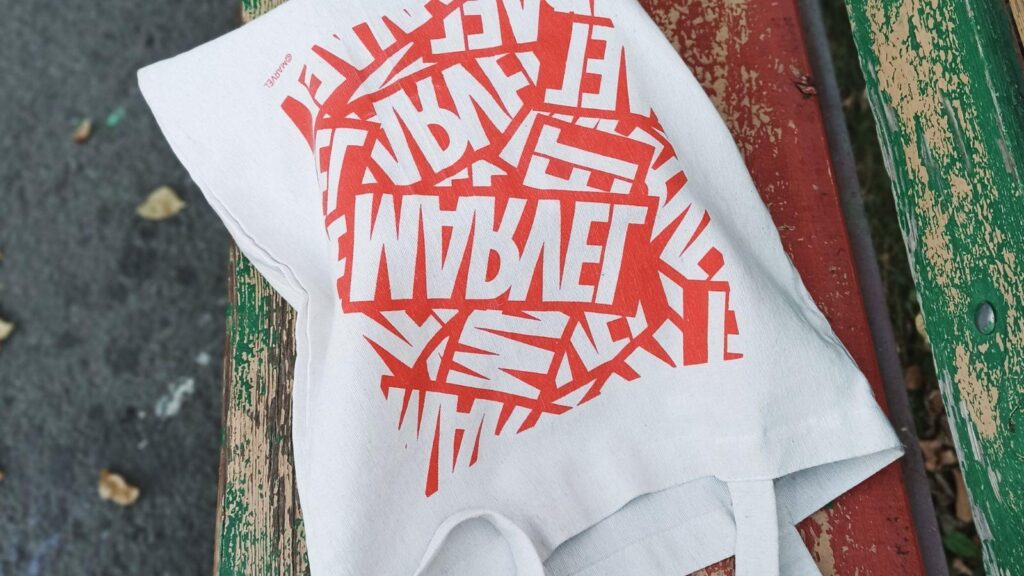
Custom tote bags are used for retail merchandise, conferences, nonprofit campaigns, employee onboarding, and promotional distribution. A polished result depends less on decoration and more on how well the design translates from screen to fabric.
Tote bag mockup design tools allow designers to preview layout, spacing, and scale before production. Instead of guessing how artwork will sit on cotton canvas, these tools simulate real-world proportions and placement.
Among accessible starting points, you can design a tote bag with Adobe Express using ready-made templates and print-ready sizing presets. Its layout tools make it easier to establish hierarchy and spacing early in the workflow. However, strong results depend on the decisions made during each step — not on the platform alone.
The guide below focuses on the design process itself: how to structure content, test layout, refine alignment, and prepare files correctly for professional printing.
Step-by-Step Guide for Using Tote Bag Mockup Design Tools
Step 1: Set Up Accurate Dimensions and Template
Goal
Create a canvas that reflects real tote bag proportions.
How to do it
- Select a tote bag template within your design tool.
- Confirm dimensions with your printer (commonly 14×16 inches).
- Enable bleed and safe area guides if available.
- Choose a mockup style that matches your intended bag (flat, gusseted, colored canvas).
- Lock guides before placing artwork.
What to watch for
- Designing without bleed.
- Forgetting safe margins near seams.
- Using social-media sized templates instead of print dimensions.
- Choosing a mockup that doesn’t match the final product material.
Tool notes
If working with vector-heavy artwork, Affinity Designer can provide precise dimension control and export settings without relying on subscription software.
Step 2: Clarify the Primary Message
Goal
Define what the tote communicates at a glance.
How to do it
- Draft one primary headline or brand message.
- Identify one secondary supporting element (if needed).
- Remove any unnecessary filler text.
- Decide early whether the design is logo-forward or message-forward.
- Write the message in large-scale format first to test readability.
What to watch for
- Overcrowded messaging.
- Competing focal points.
- Headlines too small to read at arm’s length.
- Excessively clever wording that lacks clarity.
Tool notes
Google Fonts can help you preview and test free commercial-use typefaces before importing them into your design tool.
Step 3: Design With Fabric Constraints in Mind
Goal
Ensure the design translates well onto textile material.
How to do it
- Use high-contrast color combinations.
- Avoid extremely thin linework.
- Keep intricate detail minimal.
- Test the artwork on different fabric colors.
- Zoom out to simulate distance viewing.
What to watch for
- Pale text disappearing on natural canvas.
- Complex gradients that may not print evenly.
- Artwork positioned too close to seams.
- Designs that depend on ultra-fine detail.
Tool notes
For more advanced mockup layering or texture overlays, Placeit offers realistic product mockup previews that simulate how ink interacts with fabric.
Step 4: Refine Layout and Alignment
Goal
Achieve visual balance and consistency.
How to do it
- Center or intentionally offset the design — avoid accidental imbalance.
- Use alignment and spacing guides.
- Maintain equal padding around artwork.
- Check typography scale relative to the full bag size.
- Compare multiple layout versions side by side.
What to watch for
- Optical misalignment.
- Uneven spacing between elements.
- Oversized graphics crowding edges.
- Empty areas that feel unintentional.
Tool notes
If you need advanced vector alignment precision, Inkscape can provide open-source alignment controls and path editing features.
Step 5: Test Real-World Visibility
Goal
Evaluate how the tote looks when carried.
How to do it
- Use a lifestyle mockup with a model.
- View the design at reduced size.
- Check contrast on mobile screens.
- Print a scaled paper proof and hold it at distance.
- Review the design in grayscale to test contrast strength.
What to watch for
- Text disappearing at a distance.
- Design distortion in perspective mockups.
- Visual clutter when seen quickly.
- Weak hierarchy in low-light simulation.
Tool notes
To simulate grayscale or color contrast accessibility, tools like Coolors Contrast Checker can evaluate color pair visibility before finalizing.
Step 6: Prepare the Print-Ready File
Goal
Export a file that meets production standards.
How to do it
- Confirm resolution at 300 DPI.
- Convert text to outlines if using advanced vector tools.
- Export in required format (PDF, PNG, or AI).
- Include bleed and trim marks if needed.
- Save a versioned backup file.
What to watch for
- Submitting RGB when CMYK is required.
- Low-resolution logos.
- Missing fonts.
- Incorrect file naming.
Tool notes
For color-mode verification and file inspection, Scribus can check print-ready formatting and color conversions.
Step 7: Coordinate Production and Distribution
Goal
Align the tote design with its intended rollout.
How to do it
- Confirm printing timeline.
- Request a physical sample if possible.
- Coordinate launch with marketing calendar.
- Verify shipping and fulfillment plans.
- Document version control for reprints.
What to watch for
- Printing delays.
- Color differences between proof and final run.
- Branding inconsistencies across campaign assets.
- Reordering without updated files.
Tool notes
Project management platforms like Trello can help coordinate timelines and production checkpoints without affecting the design process.
Common Workflow Variations
Photo-Based Design
Use high-resolution imagery and test color contrast carefully. Subtle tonal shifts may not reproduce clearly on cotton.
Pattern-Driven Tote
Ensure repeating graphics tile seamlessly. Vector-based editing software may provide stronger repeat precision before importing into your mockup tool.
Event Giveaway Tote
Prioritize bold, legible messaging over decorative detail.
Retail Merchandise Tote
Focus on durability of design and alignment with broader brand identity.
Before You Start Checklist
- ☐ Confirm tote dimensions
- ☐ Verify printer file requirements
- ☐ Gather high-resolution logos
- ☐ Confirm brand color codes
- ☐ Select fabric color
- ☐ Draft concise primary message
- ☐ Plan timeline
- ☐ Confirm distribution method
Pre-Export / Pre-Order Checklist
- ☐ Bleed included
- ☐ Safe area respected
- ☐ Text legible at scale
- ☐ Images 300 DPI
- ☐ CMYK verified if required
- ☐ Spelling checked
- ☐ File format correct
- ☐ Version saved
Common Issues and Fixes
Design looks faded after printing
Increase contrast and avoid subtle gradients.
Text appears smaller than expected
Print a scaled proof before final export.
Artwork shifts off-center
Account for optical balance, not just numeric centering.
Unexpected cropping
Recheck bleed and safe area guidelines.
Color mismatch
Request a proof before full production.
How To Use Tote Bag Mockup Design Tools: FAQs
Do I need a template?
Templates help prevent scaling errors and simplify bleed management.
What file format works best for printers?
Most printers accept PDF or high-resolution PNG. Confirm beforehand.
Is a mockup necessary?
A mockup helps identify spacing and visibility issues before printing.
Should I test multiple layouts?
Comparing two or three versions can clarify hierarchy and readability improvements.